

Services
LANDING
PAGE
DESIGN
Turn campaign clicks into customers, enquiries, or booked calls.
English-speaking landing page design in Barcelona. We design fast, focused landing pages with one job: getting the right people to buy, book, enquire, or sign up.
Are you wasting good traffic on a cluttered page?
Leads do not only slip through cracks. They slip through clutter.
When visitors land on a generic page, they have to hunt for the offer, the proof, the price, or the next step. Many leave before they buy, book, or enquire.
If you are already sending people to a campaign, launch, or offer, every click should land on a page with one clear path forward.
Landing page design in Barcelona, built for one clear job.
We handle the strategy, copy, design, and build. First, we work out what your visitors need to understand before they act. Then we shape the page around one offer, one audience, and one next step.
AI can help us research faster, but your page is not written by a machine. The copy is shaped by a human, checked against real buyer doubts, and built to make buying, booking, or enquiring feel easy.
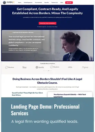
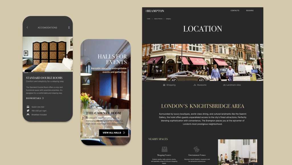
See what a focused landing page looks like
What it gets you
- Expect streamlined web content, a standout Call-To-Action copy & design that builds trust in seconds
- More qualified customers and inquiries brought to you, less chasing dead ends. You will be able to see potential customers with high buy-intent from casual vistors.
- Easy‑to‑use Web Analytics that show where to improve next. Small changes, big lift to sales or bookings.
Want to improve your site before you hire help?
6 ingredients of a landing page that gets action:
Let’s be clear: a landing page isn’t a brochure, it’s a decision engine. It greets fast, makes one promise, shows proof, and points to a single next step. When those pieces line up, people act. When they don’t, they bounce. So, what are the pieces that actually move the needle?
1. Human-written copy
Clear, specific words that sound like your business, not generic AI filler.
2. One clear path
No cluttered menus, mixed messages, or distracting links, just one next step. A Call-To-Action (CTA) button does this great. Eg. “View demo” or “Find out more”, etc.
3. Positioning based on evidence
Built around customer questions, search intent, and campaign goals — not design guesswork.
4. Answers at the right moment
Copy that handles common doubts before visitors leave.
5. Easy ways to act
Simple forms, WhatsApp chat, calendar links, checkout buttons, or enquiry CTAs placed where visitors need them.
6. Fast loading
Lightweight pages built for impatient mobile users.
Social proof, trust badges, and testing
It’s worth noting that three more details win the click:
- A headline that says your promise in one line,
- Real reviews and star ratings close to the CTA buttons
- A simple layout built for thumbs on a phone.
After launch, we watch where visitors stop, scroll and leave, then test headlines, buttons and photos head to head.
We keep what works and wins, cutting out the rest.
Your simple path from traffic to action
We are
The partner who turns up every week for you
A COMPLETE & MULTI-FUNCTIONAL PRO...
Taking care of the functional specs, design and usability details of all projects he’d managed… I recommend Kevin & his crew to anyone looking for a complete and multifunctional pro to manage all kind of Web projects.
Frequently asked questions
A landing page is a focused web page built around one specific goal.
That goal might be getting someone to buy, book a call, request a quote, sign up, download something, register for an event, or enquire about an offer.
A homepage introduces your business as a whole.
A landing page focuses on one offer, one audience, and one next step.
That makes it useful for ads, launches, campaigns, product promotions, email traffic, and specific services.
Often, yes. Your website may explain your business overall, but a landing page gives one campaign, service, product, or offer a clearer path to action.
It is especially useful when sending traffic from ads, social media, email, partnerships, or a launch.
A strong landing page usually includes a clear headline, offer explanation, benefits, proof, answers to common doubts, one main call-to-action, and a simple way to act.
That might be a form, WhatsApp button, calendar link, checkout button, or enquiry button – we call this Call-To-Action (CTA) buttons.
If you scroll up in this page a bit, you´ll see that we´ve listed 6 key ingredients in making it work well.
Yes we do. Landing page strategy, copy, design, and build work best together, all of which we provide as a service.
We shape the copy around what visitors need to understand before they buy, book, enquire, register, download, or sign up.
Yes. Brass Onion Studios is based in Barcelona and works with English-speaking businesses across Spain and internationally, especially in Europe. We work in a borderless remote mindset.
We can build landing pages for local services, ecommerce offers, consultants, events, launches, and remote campaigns.
Send traffic to a page built for one clear action.
If you are running ads, campaigns, launches, offers, or email promotions, do not waste clicks on a generic page. Give visitors one clear reason to act and one easy way to do it.
Outcomes:
- More sales, booked calls, enquiries, or sign-ups
- Less wasted campaign traffic
- Clearer analytics showing what visitors do
- A central page you can use for campaigns, launches, products, or offers.
No obligation. In 30 minutes, we’ll map out your target goals and next steps.
Or keep searching, juggling vendors, and fighting fires.
Without a guide, the customer data you need gets missed or misused, and big decisions stay guesswork.